-

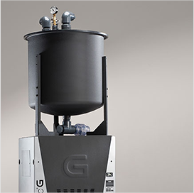
 Dental Practice SafetyOur imaging and sterilization workflow solutions help you create a safe environment for all, while maximizing efficiencies and satisfaction for patients and staff.
 -

 Ergonomic DentistryOur equipment is designed to promote proper posture for doctors, assistants and patients alike, while helping to provide the workflow that best suits your practice needs.
 -

 High-Performance DentistryImproving your practice performance requires a skillful combination of technology, workflow and expertise in the dental space that only Midmark can provide.
-

 Dental SchoolsWe shine in support for dental schools from our reliable professional solutions to our partnerships with colleges and the communities they serve.
 -

 Dental Support Organizations (DSO)With a broad range of clinical solutions, short product lead times and reliable support, we provide a consistent experience that lets you better serve your patients.
 -

 Independent DentistsOur total equipment solutions and clinical design specialists are standing by to help, you can get back to focusing on the exceptional care you provide to your patients.
-

 Architectural ResourcesVisit our planning and design library for the architectural resources you need.
 -
 ImpactDesignAttend this workshop to learn how to define, refine and achieve your practice goals through effective dental office design principles.
 -
 Multi-Site MasteryMulti-Site Mastery is an immersive learning experience designed for dental leaders ready to take their organization to the next level.
 -

 The Midmark ExperienceStart Here to Make Your Dream Office a Reality

Schedule your visit to explore your options for equipment and finishes firsthand. Sit in the chairs, move the units, open and close the cabinets — touch and feel what your new operatory will be like.
Our Approach to Design Experiences

At Midmark, we believe that who’s using our equipment and technology is every bit as important as how and why it’s being used.
Learn More-
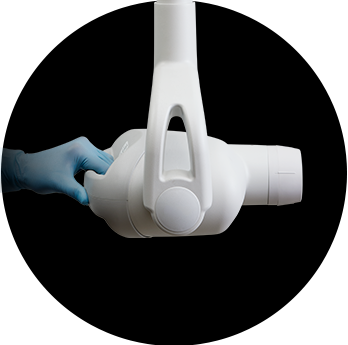 Midmark Preva Intraoral X-Ray PromotionThe order period has ended, but you can still claim your incentives through January 31, 2026. Redeem here.
 -
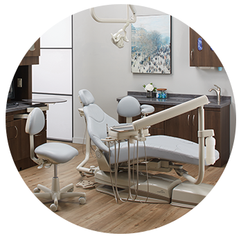 Midmark Choice PackagePair a Midmark Ultra-series dental chair and Asepsis 21® doctor's delivery system to receive 20% off your chair, delivery system and additional eligible options.
 -
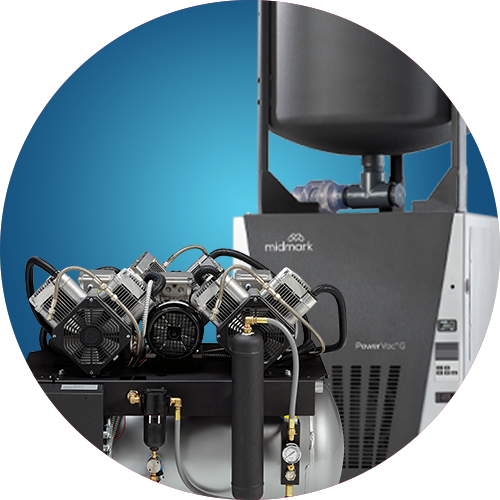 Mechanical Room PromotionUpgrade to Midmark air compressor and vacuum equipment now to claim free accessories and special savings.
2025 Sterilizer Trade-Up Promotion
2024-2025 Sterilizer Maintenance Kit Promotion
-
 Product LiteratureDesigning the best healthcare experience isn’t always easy. We can help.
 -
 Product SpecificationsReview features and technical specifications for the products you want to learn more about.
 -
 InfographicsSee the whole picture with visual explanations and real-world applications.
 -
 Webinars + PodcastsView and listen to the latest from Midmark here
 -
 EbooksLearn what we’ve uncovered about designing better care.
-
 ImpactDesignAttend this workshop to learn how to define, refine and achieve your practice goals through effective dental office design principles.
 -
 Multi-Site MasteryMulti-Site Mastery is an immersive learning experience designed for dental leaders ready to take their organization to the next level.
 -

 Service + Support | DentalAsk our Customer Experience team for help with product information, promotion details or contacting a sales representative.
 -

 Product Manuals (Technical Library)Discover everything you need to know about our products in one location.
 -

 Technical Support | DentalFind parts, documentation and more with the help of our dedicated Technical Service representatives.
 -
 Delivery + Installation ServicesMidmark Delivery Services will professionally manage your Midmark equipment shipping, delivery, staging and installation for maximum project success.
ImpactDesign

The ImpactDesign seminar, sponsored by Midmark Corporation, can help you achieve your ideal dental practice through a personalized, interactive discussion about efficient, and effective dental-specific design principles.
Learn More